App Store News - Gambling Ads Nixed, New NFT & Crypto App Regulation
Posted on October 28th, 2022
Welcome to this week’s ASO Weekly - The App Store halts gambling ads amidst outcry and the Apple takes a bite out of NFT app sales.


The App Store Icon provides users with a first impression of an app before they even click on its page. Whether the app appears as a featured app, in searches or in a category list, users will see the icon. This makes the icon an important creative asset for every app, and an understanding of App Store Optimization best practices for App Store Icons critical to conversion.
The App Store Icon is essentially the face of the app, so it should represent the most important elements, such as features or functionality. For apps with recognizable brands, like Facebook or eBay, it’s easy to use the brand iconography for the icon. Not all apps have that luxury, so their developers should use imagery that represents the biggest values of the app.
For instance, a search for "guitar" shows that most of the top apps for that term feature a guitar prominently on their icons. These create visual cues that represent the app’s functionality. At the same time, each one presents a different identity in the way the icon uses the guitar and other visual elements.
These varieties include acoustic or electric guitars, using bright or dark colors, featuring a detailed guitar or an outline of one and so forth. Each image establishes the branding and theme for its respective app. For instance, the darker shades and electric guitars typically indicate more rock-and-roll focused music options.
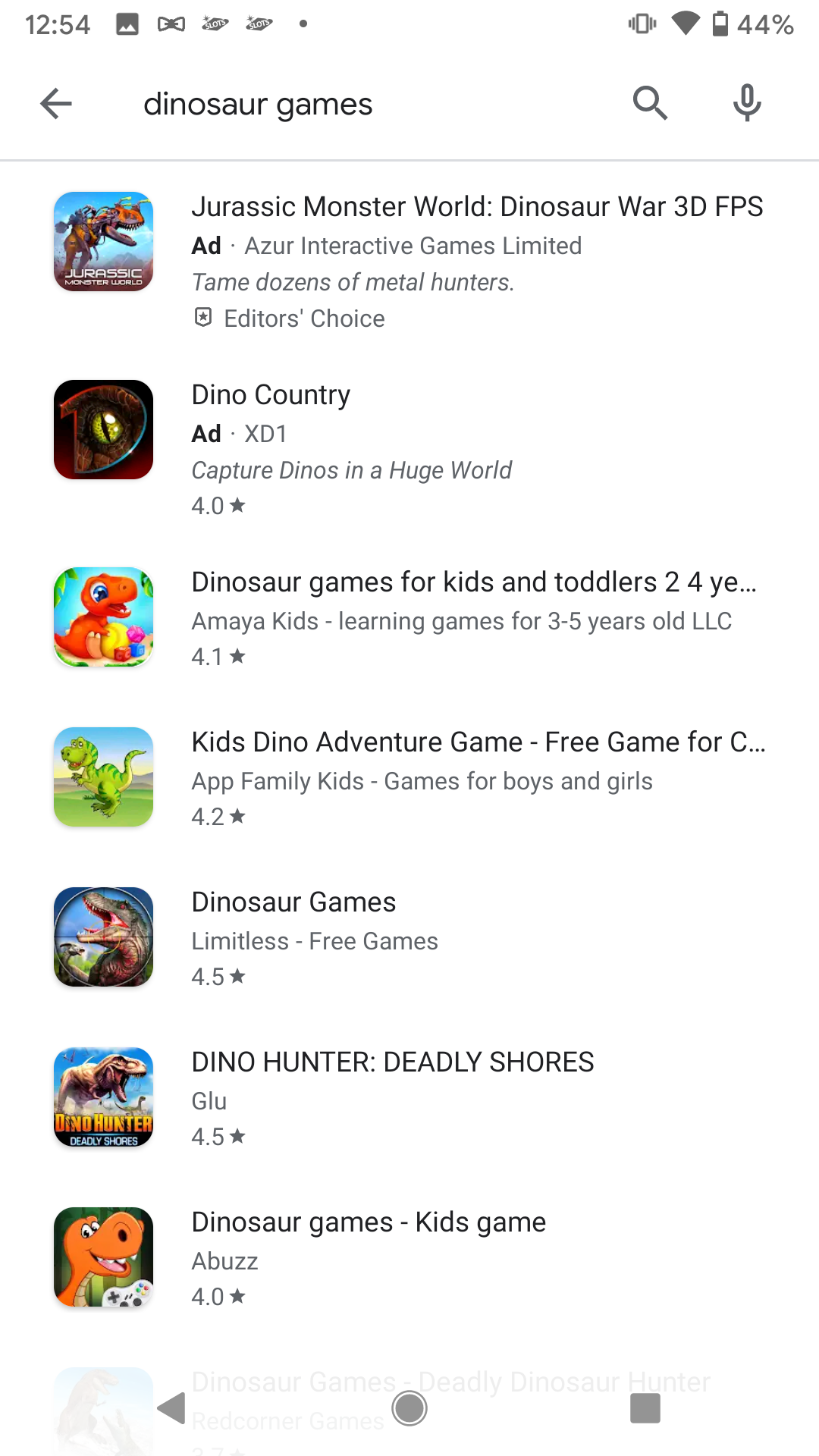
Mobile games often use their brand logo or characters to represent their apps. This is particularly common with games or apps based on specific shows or movies. As an example, a search for “dinosaur games” comes back with several apps featuring similar design styles, each presented differently. They typically feature a single dinosaur (usually a tyrannosaurus rex) in the art style of the game.
The specific stylistic choices for the icon, such as with a smiling cartoon character or a roaring and more detailed dinosaur, indicate where the app fits in the variety of dinosaur games. They set the tone and indicate the age range. Some of these also include the game’s logo, while others use the logo as the entire icon.
App Store Icons are small compared to the screenshots, especially when viewed on a mobile device. This means that a simple design can be far more effective.
Attempting to fit an excessive amount of imagery into a single icon can result in it looking cluttered and incoherent. Focus on the essentials, rather than including everything at once. Even if an icon seems good when designing it, developers should check how it looks in low resolution. Important details may get lost or compete for space when viewed at screen size.
If a mobile game has twenty characters, include the protagonist and perhaps one supporting character. If an app provides a variety of photo filters, it may be detrimental to use too many on the icon. The icon should remain clear as it fits into the small on-screen box.
Similarly, text should be used properly. Text must be concise and legible at low resolution without competing with other elements of the icon. Using bold text or a title can work, but there’s no room on the icon to fit a verse of poetry. It will simply be unreadable and take up space on a small icon.
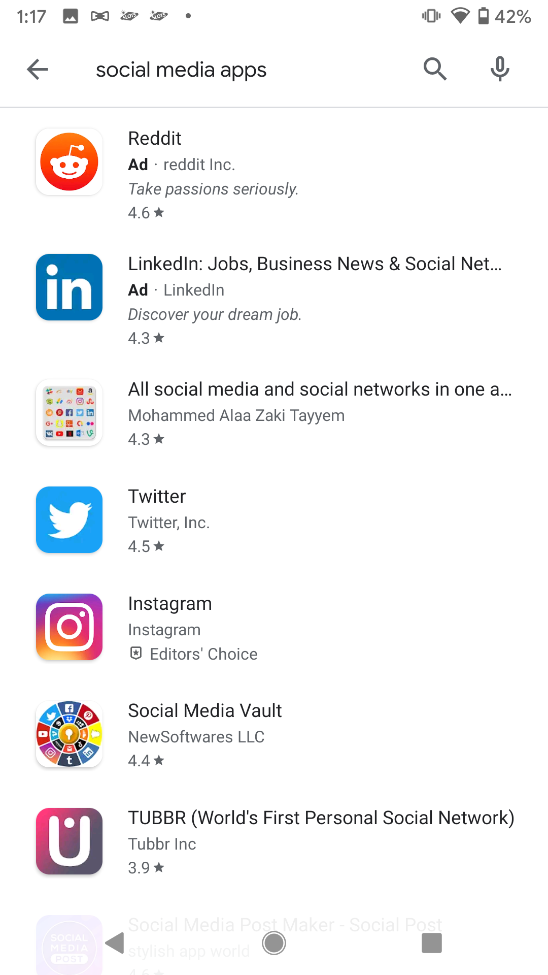
This is another instance where having a strong brand identity is useful. We can see branded icons come into play for social media apps, where icons utilizing brand-specific iconography (such as Twitter and Instagram) are easy to identify.

As with any creative element, App Store Icons should be thoroughly researched and tested. Developers can compare competitor icons to see common recurring themes, such as the color palettes, icon borders and characters or imagery used.
Developers should identify the top competitors for their keywords and see what elements are in those icons. This can provide guidance and inspiration while identifying what audiences respond well too. From there, they can incorporate elements that they identified with their current designs in order to stand out from the crowd.
Developers can also test icons to determine what drives the most conversions. As with any creative element, testing variants with iterative changes can help developers understand what users respond well to. Each test provides more insights into what works well, whether it’s certain color schemes, characters or text placement.
It’s also important to research how an icon appears in Dark Mode. Just as screenshots should be designed to look good in both Light and Dark Modes, icons should be designed with both in mind. If an icon blends in with the Dark Mode background, users may overlook it, while clashing too intensely could be a deterrent.
An App Store Icon should convey an app’s brand and purpose. The design should be simple and easy to identify when viewed on a mobile device’s screen in Light Mode or Dark Mode, including relevant iconography and minimal text. Through research and testing, developers can identify what icon designs attract the most users and continue to improve their icons as part of their App Store Optimization strategy.
Want more information regarding App Store Optimization? Contact Gummicube and we’ll help get your strategy started.
Welcome to this week’s ASO Weekly - The App Store halts gambling ads amidst outcry and the Apple takes a bite out of NFT app sales.

Welcome to Gummicube’s ASO Top Trends Vol 3 – a quick, one-stop-shop for the latest developments in ASO.
App Growth Summit (AGS) in San Francisco is a once-a-year event where some of the biggest names in the app marketing and mobile marketing industry come together to share industry insights.