PaperKarma App Store Screenshot Spotlight
July 14th, 2020

by David Quinn
VP of Strategy & Partnerships at Gummicube, Inc.
A picture says a thousand words, but sometimes an App Store Screenshot needs to say a little more. App Store listings can include several screenshots with copy to describe their purpose to users.
PaperKarma is an app designed to stop physical junk mail, recently featured on the App Store in the list of “Apps for the week ahead.” Do its screenshots convey the benefits and usage of the app? For today’s App Store Spotlight, we take a look and see.
App Store Screenshots
To begin, we should examine the screenshots on the App Store and Play Store. How many do they use? How are they designed? Do they showcase the app functionality properly? Answering these questions will help us analyze the screenshots.
Number of Screenshots
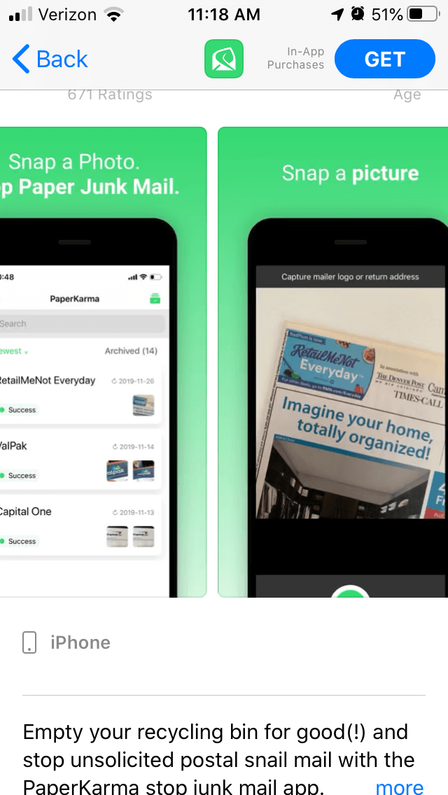
PaperKarma uses the same five screenshots on the Apple App Store and Google Play Store. Given each store’s screenshot limit, this means there’s room for five more screenshots on the App Store, and three more on Google Play.
Each screenshot is a new opportunity to provide information to users, so it has nothing to lose and potential users to gain by adding more.
Screenshot Design
The screenshots use a consistent design: a black handset on a green background. The handset shows a screenshot, while white screenshot copy adds additional contextual information.
PaperKarma faces a unique challenge: the app is designed to stop users from receiving physical junk mail, so how can it convey that using in-app imagery? The second screenshot attempts to address this through the camera function – the screenshot shows the app taking a picture of physical junk mail to show how it works.
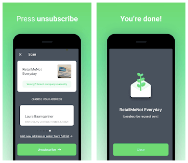
While it would be impossible to use a screenshot that shows someone not receiving mail, other screenshots show the unsubscribe request being sent. This indicates how the app is meant to work.
Showcasing Functionality
The screenshots for PaperKarma walk users through the process of unsubscribing from fliers and ads. The screenshot copy explains each step, including “snap a picture” and “press unsubscribe.”
While this is straightforward, it does not integrate many keywords into the copy or provide additional information on the values of the app and the variety of mail users can block with it.
For instance, the description calls out how users can block junk mail like catalogs, mail ads and credit card offers. The screenshots do not show this variety.
Similarly, the icon’s design, utilizing green colors and a leaf shape, would indicate an environmental theme. The description mentions how the app can help the environment by reducing paper waste, but it’s not a core focus of the description or screenshots. Integrating that messaging into the screenshots could help appeal to users concerned about waste.
How Could it Change?
There are a few areas where PaperKarma can adjust its screenshots to better follow App Store Optimization best practices. These include:
Emphasizing additional values
Including the environmental benefits
Showcasing the different kinds of junk mail it can block
Integrating keywords into its screenshot copy
By researching its competition and updating its screenshots to highlight core values, benefits and keywords, PaperKarma could potentially improve its conversions. Screenshots need to make an immediate impression and explain to users why they should install the app.
As an example, the app Cleanfox is a junk email blocking app. While it is focused on email rather than physical mail, we can see how its use of colorful backgrounds and screenshot copy calling out the “reduce your carbon footprint” value helps the screenshots stand out.

Overall
Consider the message you want to send with your App Store Screenshots. What values do you want users to see? PaperKarma is using its screenshots to show users how the app works, although it still has room to show them what other benefits the app can provide.
Want more information regarding App Store Optimization? Contact Gummicube and we’ll help get your strategy started.
Similar Articles

Posted on April 5th, 2024
How can developers of journal apps optimize to stay relevant, differentiate themselves, and compete in the App Store? This App Store Spotlight jumps into some of the strategies employed by the top journal apps. Jump in to learn more.

Posted on March 15th, 2024
In this App Store Spotlight, we dive into the intricacies of optimizing finance apps and analyze the unique considerations of one of the most popular categories in the app stores.

Posted on February 23rd, 2024
Gaming is the largest category in the app stores by far. One out of every six games on the app stores is a mobile game, so how can you stand out from the competition? Find out in this App Store Spotlight.